


News & Columns
Service logo renewal. ~Logo creation Part 1
A few months after the launch of the MySiteTranslation website, we decided to renew the MySiteTranslation service logo.
The logo was to convey the fact that it was a web translation service, and to give it a global feel.
(I also wanted the logo to be catchy enough to be put on a sticker... 🙄 ) It was with this personal desire in mind that we began work on the logo.
The logo was created by Matsunawa (En+D), a designer who has worked on numerous corporate logos.
Matsunawa has designed logos for many TV dramas and movies, as well as corporate logos and the logo for the No. 1 DJ unit Shannon Brothers.
Logo designed by Matsunawa
We had a thorough meeting to determine the concept and direction of the project until we were satisfied with the final logo, and asked Matsunawa-san to come up with three different logo designs.
Difficult concept and direction
This is how the My Site Translation logo design process began,
The name of the My Site Translation service is My(romaji) Site(Katakana) Translation(Kanji) The name of the service is "My(romaji) Site(Katakana) Translation(Kanji)",
The name is a technical(?) combination of three kinds of characters. The service name was not as cool as the recently popular horizontal letter service names. The concept and direction of the logo were difficult to determine...
The direction and concept of the logo became clear through a series of online meetings.
The following two points were chosen as the direction of the logo!
The logo should incorporate the changing symbolic letters of translation.
The logo should incorporate the characteristic "M" and "y" of "My Site Translation".
Logo image created after initial ideation
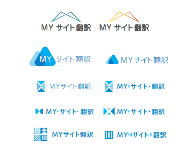
The logo mark should incorporate the letter M and the letter y of My Site Translation, which is a distinctive feature of the site,
From here, the process of trial and error begins until the logo is completed.
To be continued in Part 2!