News & Columns
Service logo renewed. ~Logo production final


After declaring that it would continue with the second episode... - 7 months. It is not that I have never, really, forgotten. (Click here for the first time)
I always had the feeling that I had to write a blog in the back of my mind.
I know I shouldn't use busyness as a reason, but I was so busy that I didn't have time to write.
That's why I kept you waiting. This is the second and final logo production note.
As declared last time, trial and error begins until the completion of the MY → site → translation, the changes in the characters, and the logo mark incorporating M.
In addition, instead of the logo type like last time, we decided to design a logo that can be used horizontally or vertically, with a logo mark + letter type.
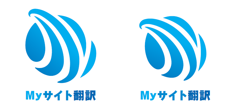
M+Y Design

I boldly incorporated my as a logo into the design.
A design that abstractly incorporates M and Y into a sphere

The sphere is also one of the designs that I often see, and I had a design put in it so that it looks like My.
Logo design with translation translation

As a result of voting within the company on which logo direction to go from among the logos that were ideated as above,
There were various twists and turns, such as the selection of a different logo, but there was no such vote due to the authority of the person in charge.
"There aren't many other logos that use kanji for translation."
From the designer's opinion, I decided to dig a little deeper into the translation logo.
The finished form of the logo is visible.

Here, I was inspired to think of My as a feather dot, and I was able to see the finished form of the logo that I was satisfied with.
Finally, the logo is complete! !

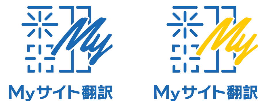
By changing the color of the letter My of the original idea, and by bordering around the letter My,
Finally, the logo of My Site Translation that I am satisfied with is completed.
Logo Concept (En+D Matsunawa)
A version made with the character "Fan" in translation as a symbol.
When I got to the bottom of what the service does, it became the character "Fan".
The image of the word translation is difficult to work and has a hard image, so when symbolizing a sticker,
It will also be conscious of the pop so that you can paste it on your PC.
It was the original plan, but the My part was streamlined and moved.
It expresses the process of translation and change.
From the first idea, it took about three months to ask for revisions many times, and they made it
Thank you very much to the designer, En+D Matsunawa.
The design of this Japanese kanji and the literal "My" site "Flip" translation will flutter "feathers" to the world.
Thank you for your continued support of the new My Site Translation logo design.


